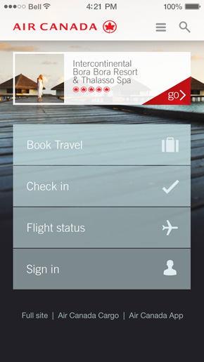
Air Canada Website Redesign
This proposal for a redesign of the Air Canada website was approached with responsive design and accessibility in mind.
The goal was to redefine the customer experience, creating a traveller-friendly portal.


This proposal for a redesign of the Air Canada website was approached with responsive design and accessibility in mind.
The goal was to redefine the customer experience, creating a traveller-friendly portal.


Mockups for a proposed cross-platform MyBell app.


A configurable fitness tracker that follows you across platforms. Designed for quick-glance ease of use.


This concept for an Air Canada Vacations iPad app was developed in 2010, shortly after the iPad was introduced.


The goal of this refresh was to bring the TimmyMe app up-to-date, with a more modern visual design and a unified tablet layout.


These high-level journey maps were presented to potential customers to help IBM communicate their solutions in an easily-digestible format. I also had a lot of fun creating the icons.


What will your banking experience look like in the future? These UI designs and presentation slides envision a world where your bank is available to you wherever and whenever you need it.


You're attending a Raptors Game with a group of friends. What can an app do to make the experience better? Be your ticket, save you money, find a good parking spot, and find your car at the end of the game.
More importantly, where are the shortest beer lines?

These mockups were part of an exercise to bring the ING banking app to tablets.


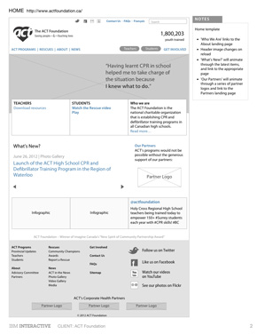
The ACT Foundation trains thousands of students in CPR every year, but their website was outdated and hard to use. This redesign started as a visioning workshop to help define their needs. The end result is a website that works well for the core audiences and for the foundation.
